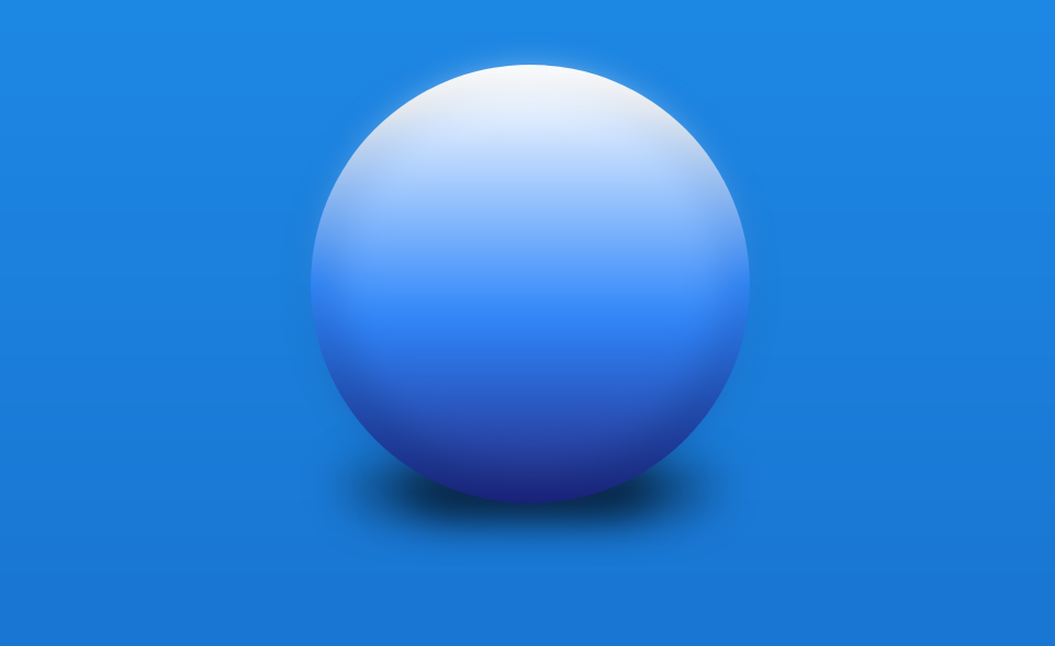
Although not always practical, creating the illusion that some of your web elements are 3D can be a fun experiment. I set out to see if I was able to create such an illusion with only 2 HTML elements and as little CSS as possible.
This is what I ended up creating:
The HTML
Prepare for your mind to be blown:
<div class="main-orb">
    <div class="inner-orb"></div>
</div>
That's it - I wasn't kidding when I said we would use only 2 HTML elements. The .main-orb is the core shape (set to 400x400) and the .inner-orb is placed on top of it's parent at a slightly smaller size (360x360) - but more on that below in the CSS portion.
The CSS
First we give the bigger orb element (.main-orb) the default styling needed to represent a 2D circle:
.main-orb {
    background: linear-gradient(#fff 0%, #eee 10%, #2E86FB 50%, #1A237E 100%);
    border-radius: 9999px;
    height: 400px;
    margin: 4rem auto;
    position: relative; /* This is important for the inner orb element later */
    width: 400px;
}
Next, we include both :before and :after pseudo elements for our orb's drop shadow. You could do this with a simple box-shadow property on the .main-orb itself, but I've explained in a previous post why that's not the best approach.
/* Shared styling for both pseudo elements - Remember DRY */
.main-orb:before, .main-orb:after {
    border-radius: 200px 200px 9999px 9999px;
    bottom: -10px;
    content:'';
    filter: blur(20px);
    height: 40px;
    position: absolute;
    z-index: -1;
}

/* Bigger, lighter shadow */
.main-orb:before {
    background: rgba(0,0,0,0.4);
    left: 7.5%;
    width: 85%;
}

/* Smaller, darker shadow */
.main-orb:after {
    background: rgba(0,0,0,0.7);
    left: 20%;
    width: 60%;
}
With our main orb complete we can move on to the .inner-orb element to help bring slightly more depth to our floating ball of CSS:
.inner-orb {
    background: linear-gradient(#fff 0%, #2E86FB 60%, #283593 100%);
    border-radius: 9999px;
    box-shadow: 0 8px 20px rgba(0,0,0,0.5);
    height: 360px;
    filter: blur(18px);
    left: 20px;
    position: absolute;
    top: 15px;
    width: 360px;
}
Poor-man's 3D elements
Clearly implementing something like this will never come close to generating true 3D renders on a website, but it is a fun exercise to see how much further we can push simple CSS. Feel free to fork the above CodePen to play around with different colors and shadow placements.