Like many other Github users, I am not a big fan of their recent repository page redesign. In my mind it seems like a change just for the sake of change - the original UI worked perfectly fine.
Sigh.
I was planning on recreating the original Github layout with custom CSS but decided against it. Tackling such a big change in design would cause headaches if Github ever changed even one simple class or id on a given element. My final conclusion was to just improve their new design with my own personal quality of life improvements.
So, enough chit-chat. Let's get into it.
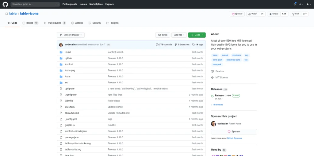
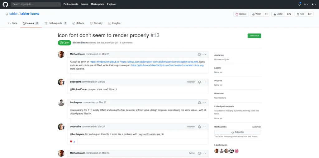
Current Design (2020)
The default view for a repo's homepage and ticket items are locked at a set max-width. This causes some visual strain in comparison to the full-width headers and navigations directly above. I use a decently sized montior when using your app Gitub - let me use all the space available to me!
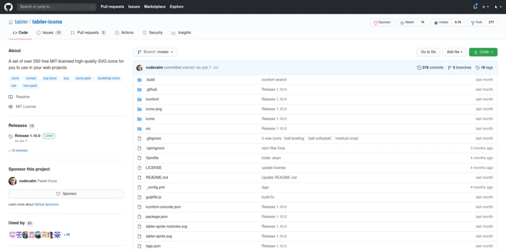
My Improvements
Your users shouldn't have to jump around the page looking for the important information they want to see. Resetting the basic repo information to the left side of the screen allows user to instantly read-up on the project details. (This design is catered towards left-to-right readers mind you).
We now also utilize all the available screen space, dependent on the user's browser window size.
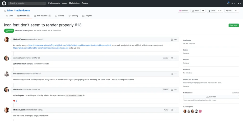
We make similar updates to the ticket item view and also remove the out-of-place margin-bottom from the project link headers.
Try It Yourself!
You can very easily implement these custom CSS changes with an extension for the browser of your choice:
Then create a new custom CSS file to target github.com with the following properties:
.container-xl {
    max-width: 100%;
}

.repository-content .gutter-condensed.gutter-lg {
    flex-direction: row-reverse !important;
}

.repository-content #discussion_bucket .gutter-condensed.gutter-lg {
    flex-direction: row !important;
}

.repohead > div.d-flex {
    margin-bottom: 0 !important;
}

#show_issue {
    display: flex;
    flex-direction: row;
    flex-wrap: wrap;
}

.repository-content #discussion_bucket,
#partial-discussion-header {
    width: 100%;
}
That's it! Feel free to improve on this and further make it your own! I might create a new repo for this project if I end up adding even more improvements to the core CSS.