When thinking through navigation designs for mobile devices sometimes the best option is to store away the content behind a toggle button. This button would then display the menu items upon interaction. Let me show you how to create such an element with only CSS - no need for JavaScript today!
Before we begin
I would like to point out that the concept of "toggling" the main menu (even for mobile) is not always the best solution. If you're interested, you can take a look at a previous article I wrote explaining why: Using Hamburger Menus? Try Sausage Links
Now that we have mentioned possible pitfalls of relying so heavily on toggle menus, let's build one!
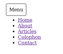
Our Final Product
The HTML
To implement this design you really don't need much in terms of HTML:
- A single
checkboxinput - A
labelthat corresponds to thecheckbox - A
navelement to house our unordered list items
<!-- The checkbox input & label partner -->
<input type="checkbox" id="menu-toggle">
<label for="menu-toggle">Menu</label>

<!-- The navigation we wish to toggle -->
<nav>
    <ul>
        <li><a href="">Home</a></li>
        <li><a href="">About</a></li>
        <li><a href="">Articles</a></li>
        <li><a href="">Colophon</a></li>
        <li><a href="">Contact</a></li>
    </ul>
</nav>
That's it!
The CSS
The first thing we need to do is "hide" the checkbox input element. It's important to avoid using display: none or visibility: hidden in order to achieve this. Those CSS properties can negatively impact accessibility (specifically screen readers). So we will be relying on the position, z-index and opacity properties to help us out.
/* Set the input position to absolute, send it off screen with zero opacity */
input[type="checkbox"] {
    left: -9999px;
    opacity: 0;
    position: absolute;
}
Then we give our corresponding label a minor face-lift to make it appear more button-like:
/* Minor visual styling to make the label more button-y */
label {
    border: 1px solid currentColor;
    border-radius: 4px;
    cursor: pointer;
    padding: 10px;
}
For our main nav element, we want to set it's position to absolute in order to avoid any janky page rendering issues that might occur when toggling the menu:
` /* Set nav to absolute (avoids odd page rendering space pop-in) */ nav { opacity: 0; position: absolute; z-index: -2; }
The last step is to actually show the menu if the user toggles the checkbox:
/* Show nav when checkbox is checked */
input[type="checkbox"]:checked ~ nav {
    opacity: 1;
    z-index: 1;
}
It might not look like much, but you now have a fully functional menu toggle - made with pure CSS!
With Great Power...
Although this design is very simple to implement, please remember to use these types of menus wisely. Just because you can do something, doesn't always mean you should.