I often feel like an old man when I complain about flat design and how designers these days have lost (or willfully forgotten) the skill to create accessible UIs with proper visual hierarchy. A skill which at it's core seems so simple - yet is overlooked in almost every current modern interface.
I'm unable to pinpoint the exact reason why designers swapped out depth, hierarchical layouts and accessibility for muted colors, abstract imagery, illegible typography, and unimaginative flat designs.
But then again, maybe I'm just a design-dinosaur of a time long forgotten. Maybe I need to adapt and move with the times. Or maybe the current design trends are just lazy.
I'm pretty sure it's lazy design trends.
Stop complaining and do something
As an example, I'm going to breakdown the process of improving the overall design on a set of "flat" button elements.
Hopefully this demo article inspires even one designer to rethink their method when approaching UI design and push away from what is currently accepted as the "correct way to design UI".
And one final note before we deep dive into this demo:
The statement that flat design is inherently worse than it's predecessor is not subjective. By stripping away the visual cues that help users distinguish between interface elements you are purposely making a worse experience for them. Designers need to stop designing for other designers.
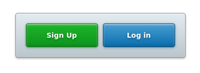
What we will be designing
In this demo we will be improving the default flat design inspired button layout of the following:
Designing the skeleton
This will be our basic HTML structure, along with it's default styling (based on today's UI standards):
The HTML
<div class="buttons-container">
    <button>Sign Up</button>
    <button>Log in</button>
</div>
The CSS
/* Parent container for the buttons */
.buttons-container {
    background: #E0E9EE;
    border-radius: 5px;
    display: flex;
    padding: 20px;
    margin: 0 auto;
    max-width: 300px;
    width: 100%;
}

/*Shared button styles */
button {
    appearance: none;
    border: 0;
    border-radius: 5px;
    color: #fff;
    cursor: pointer;
    display: inline-block;
    font-size: 14px;
    font-weight: bold;
    padding: 15px 20px;
    width: 50%;
}

/* Sign up button */
button:first-child {
    background: #2FBC3D;
    margin-right: 10px;
}

/* Log in button */
button:last-child {
    background: #459BCF;
}
Adding simple improvements
Gradients (not solely on their own mind you) within UI systems were initially used to help humans make connections with their analog counterparts. Something like toggles or switches matching those found in the real world, allowed users to mentally connect what that element's function did almost instantly.
Be warned not to confuse this with skeuomorphic design - an element sharing similar qualities as it's analog sibling does not instantly make it so.
If you ever run into a designer who rolls their eyes or scoffs at you for proposing the use of something such as gradients (in a tactful way, of course) it is safe to assume they have been brainwashed by the modern design hive-mind.
To disregard the use of gradients simply because the belief is "gradients are bad" is idiotic. Worse still is to do so based on the belief that "gradients aren't in right now". As a designer, your job is to design a beautiful and usable product - not win high-fives among your peers. /end rant.
Adding subtle gradients
When gradients are implemented properly, most users won't even be aware of their presence. The difference in color (specifically on buttons in this example) helps give the illusion of a light source in the interface, which designers can use to their advantage (ie. pull more attention to elements by "lifting" them forward on the page).
The subtly improved CSS
/* Sign up button */
button:first-child {
    background-image: linear-gradient(-180deg, #1EB52A 0%, #0D941C 100%);
}

/* Log in button */
button:last-child {
    background-image: linear-gradient(-180deg, #489FD2 0%, #0A6DAC 100%);
}
More depth & light
With our subtle gradients we are closer to creating a solid contrast between interactive elements, but we can improve this even further. By adding some more depth with a harder light source and more pronounced outlines, we allow the button elements to stand out on their own more strongly.
This is fairly easy to accomplish with CSS using the very basic box-shadow, text-shadow and border properties:
/* Parent container */
.buttons-container {
    background-image: linear-gradient(0deg, #BBC6CD 3%, #E2EBF0 100%);
    border: 1px solid #8D8D8D;
    box-shadow: 0 2px 4px 0 rgba(42,42,42,0.40), inset 0 1px 3px 0 rgba(255,255,255,0.50);
}

/* Shared button styling with text-shadows */
.buttons-container button {
    text-shadow: 0 2px 4px rgba(0,0,0,0.30);
}

/* Sign up button */
.buttons-container button:first-child {
    background-image: linear-gradient(-180deg, #1EB52A 0%, #0D941C 100%);
    border: 1px solid #0C6B16;
    box-shadow: 0 1px 5px 0 rgba(9,116,21,0.50), inset 0 -1px 6px 0 rgba(0,0,0,0.20), inset 0 1px 0 0 rgba(255,255,255,0.50), inset 0 2px 4px 0 rgba(255,255,255,0.50);
}

/* Log in button */
.buttons-container button:last-child {
    background-image: linear-gradient(-180deg, #489FD2 0%, #0A6DAC 100%);
    border: 1px solid #0A486E;
    box-shadow: 0 1px 5px 0 rgba(9,85,133,0.50), inset 0 -1px 6px 0 rgba(0,0,0,0.20), inset 0 1px 0 0 rgba(255,255,255,0.50), inset 0 2px 4px 0 rgba(255,255,255,0.50);
}
For easy reference, here is the CSS styling in it's entirety:
/* Parent container */
.buttons-container {
    background-image: linear-gradient(0deg, #BBC6CD 3%, #E2EBF0 100%);
    border-radius: 5px;
    border: 1px solid #8D8D8D;
    box-shadow: 0 2px 4px 0 rgba(42,42,42,0.40), inset 0 1px 3px 0 rgba(255,255,255,0.50);
    display: flex;
    padding: 20px;
    margin: 0 auto;
    max-width: 300px;
    width: 100%;
}

/* Shared button styling */
button {
    appearance: none;
    border: 0;
    border-radius: 5px;
    color: #fff;
    cursor: pointer;
    display: inline-block;
    font-size: 14px;
    font-weight: bold;
    padding: 15px 20px;
    text-shadow: 0 2px 4px rgba(0,0,0,0.30);
    width: 50%;
}

/* Sign up button */
button:first-child {
    background-image: linear-gradient(-180deg, #1EB52A 0%, #0D941C 100%);
    border: 1px solid #0C6B16;
    box-shadow: 0 1px 5px 0 rgba(9,116,21,0.50), inset 0 1px 0 0 rgba(255,255,255,0.50), inset 0 2px 4px 0 rgba(255,255,255,0.50);
    margin-right: 10px;
}

/* Log in button */
button:last-child {
    background-image: linear-gradient(-180deg, #489FD2 0%, #0A6DAC 100%);
    border: 1px solid #0A486E;
    box-shadow: 0 1px 5px 0 rgba(9,85,133,0.50), inset 0 1px 0 0 rgba(255,255,255,0.50), inset 0 2px 4px 0 rgba(255,255,255,0.50);
}
Going even further with this UI
This demo article only showcases how to improve on a basic button UI structure with a focus on proper hierarchy between elements.
Once completely developed, these element should support all interactive states (hover, active, disabled) and animations to make for a more engaging experience.