Everyone can appreciate fancy, animated buttons - but often times they come with a performance cost: JavaScript. Luckily for us, we can create our very own shiny, animated buttons with pure CSS.
The Demo
The HTML
Nothing fancy going on here, just a set of ahref elements with specific button classes added:
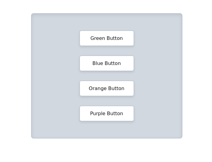
<a href="#" class="button green"><span>Green Button</span></a>
<a href="#" class="button blue"><span>Blue Button</span></a>
<a href="#" class="button orange"><span>Orange Button</span></a>
<a href="#" class="button purple"><span>Purple Button</span></a>
The CSS
First we set the default base styling for all the buttons. We also place the inner text into span elements (I will explain why in a little bit):
.button {
    background: white;
    border: 1px solid #a5b1c2;
    border-radius: 6px;
    box-shadow: 0 4px 8px rgba(0,0,0,0.1);
    color: #111111;
    display: inline-block;
    margin: 1rem auto;
    min-width: 180px;
    overflow: hidden;
    padding: 15px 30px;
    position: relative;
    text-align: center;
    text-decoration: none;
    transition: .3s ease-in-out all;
}
.button span {
    position: relative;
    z-index: 2;
}
Now we need to create our shiny element that will pass across the button on hover or focus. For this object we will use the before pseudo element:
.button:before {
    background: linear-gradient(transparent 0%, rgba(255,255,255,0.6) 50%, transparent 100%);
    content:'';
    height: 200%;
    position: absolute;
    right: calc(100% + 20px);
    top: -55%;
    transform: rotate(-70deg);
    transition: .6s ease-in-out right;
    width: 80px;
    z-index: 0;
}
Next, we tell the before element to swipe across the main .button parent element when the user hovers or focuses on it. Remember placing our inner content into a span element? That insures that our shiny/swipe element doesn't position itself over the text, but instead flows under it:
.button:hover:before {
    right: -100%;
}
/* Extra visual styling for buttons on hover - optional */
.button:hover, button:focus {
    box-shadow: 0 8px 12px rgba(0,0,0,0.1), inset 0 10px 30px rgba(255,255,255,0.3), inset 0 2px 2px rgba(255,255,255,0.2);
    color: white;
}
All that's left is adding some visual flare to each individual button - in this case background-color and border-color:
.button.green:hover, button.green:focus { background: #20bf6b; border-color: #20bf6b; }
.button.blue:hover, button.blue:focus { background: #0984e3; border-color: #0984e3; }
.button.orange:hover, button.orange:focus { background: #ff793f; border-color: #ff793f; }
.button.purple:hover, button.purple:focus { background: #6c5ce7; border-color: #6c5ce7; }
Browser Support
These buttons work across all browsers flawlessly. See the details on the caniuse report itself.
The Live CodePen
You can find the live demo embedded at the top of this post, or directly on CodePen here.