Just because we can, let's make a quick demo on how to build interactive elements based off the original Mario punch blocks.
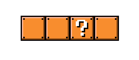
What our final product will look like:
The HTML
The set of Mario blocks doesn't require a huge amount of effort for it's html structure, we only need:
- Parent div for each block
- Checkbox input
- Checkbox label
- Inner label divs to represent the block "dots"
Sidenote: This is only how I chose to add the inner dots to the Mario blocks. There are many other ways to create these, so please feel free to implement them however you see fit.
<!-- Main parent block -->
<div class="mario-block">

    <!-- Checkbox input (disabled by default) -->
    <input type="checkbox" id="1" disabled>

    <!-- Checkbox label -->
    <label for="1">
        <!-- Inner dots for blocks -->
        <div class="dot"></div>
        <div class="dot"></div>
        <div class="dot"></div>
        <div class="dot"></div>
    </label>

</div>
Now we just add as many default blocks we want, along with the interactive punch block (.mario-block--question):
<div class="mario-block">
    <input type="checkbox" id="1" disabled>
    <label for="1">
        <div class="dot"></div>
        <div class="dot"></div>
        <div class="dot"></div>
        <div class="dot"></div>
    </label>
</div>

<div class="mario-block">
    <input type="checkbox" id="2" disabled>
    <label for="2">
        <div class="dot"></div>
        <div class="dot"></div>
        <div class="dot"></div>
        <div class="dot"></div>
    </label>
</div>

<div class="mario-block mario-block--question">
    <input type="checkbox" id="3">
    <label for="3">
        <div class="dot"></div>
        <div class="dot"></div>
        <div class="dot"></div>
        <div class="dot"></div>
        <div class="question-mark"></div>
    </label>
</div>

<div class="mario-block">
    <input type="checkbox" id="4" disabled>
    <label for="4">
        <div class="dot"></div>
        <div class="dot"></div>
        <div class="dot"></div>
        <div class="dot"></div>
    </label>
</div>
The CSS
First we need to remove the default checkbox input styling and place all new styling on it's corresponding label.
/* Mario block parent div */
.mario-block {
    display: inline-block;
    height: 80px;
    margin-right: -7px; /* Fixes inline-block margin bug */
    position: relative;
    width: 80px;
}

/* Hide default checkbox input */
.mario-block input {
    position: absolute;
    visibility: hidden;
    z-index: -1;
}
Now to target the label elements found inside the block:
/* Style checkbox label accordingly */
.mario-block label {
    background: #F88D2E;
    border: 4px solid #070000;
    box-shadow: inset -4px -4px 0 #965117, inset 4px 4px 0 #FAB89B;
    display: block;
    height: 100%;
    position: relative;
    width: 100%;
}
Next we style our included .dots elements to be placed in the four corners of each block:
.mario-block .dot {
    background: #070000;
    height: 5px;
    position: absolute;
    width: 5px;
}
.mario-block .dot:nth-child(1) {
    left: 4px;
    top: 4px;
}
.mario-block .dot:nth-child(2) {
    right: 4px;
    top: 4px;
}
.mario-block .dot:nth-child(3) {
    bottom: 4px;
    left: 4px;
}
.mario-block .dot:nth-child(4) {
    bottom: 4px;
    right: 4px;
}
Punch-able block
Now we need to include the "question mark" SVG and custom CSS for the interactive Mario block. You can download a copy of the custom svg question mark I created.
.mario-block--question label {
    cursor: pointer;
}
.mario-block--question .question-mark {
    background-image: url('/public/images/mario-block-question-mark.svg');
    background-position: center;
    background-repeat: no-repeat;
    background-size: 40px;
    bottom: 0;
    left: 0;
    position: absolute;
    right: 0;
    top: 0;
    z-index: 1;
}
The last piece
The last item we need to design is the checked state of the interactive question mark block. The extra inner dark dashes will be added as pseudo elements:
/* Mario block in `checked` state */
.mario-block input:checked + label {
    background: #885818;
    box-shadow: inset -4px -4px 0 #68400B, inset 4px 4px 0 #FAB89B;
}

/* Hide both the default dots and question mark svg on checked */
.mario-block input:checked + label .dot,
.mario-block input:checked + label .question-mark {
    display: none;
}

/* Shared pseudo element styling */
.mario-block input:checked + label:before,
.mario-block input:checked + label:after {
    content: '';
    height: 20px;
    position: absolute;
    transform: rotate(45deg);
    width: 20px;
}

/* Right dash */
.mario-block input:checked + label:before {
    border-right: 4px solid #070000;
    right: 18px;
    top: 15px;
    transform: rotate(45deg);
}

/* Left dash */
.mario-block input:checked + label:after {
    border-left: 4px solid #070000;
    left: 18px;
    top: 15px;
    transform: rotate(-45deg);
}
That's it!
Taking it further
As always, you can take this concept and flesh it out even further. I was trying to mimic the "pixel" style of the original Mario games, but you could make the lighting and depth more realistic with some extra subtle gradients or filter properties.